
Text and curved lettering
Raised or engraved lettering in seven typefaces or one of your own, and if you like along a circular arc, such as on a coin, a lid or a ring.
Adding text
Choose “Text” in the shape library and place it. In the “Text” field on the right, type what it should say. The settings below:
- “Font”: Seven typefaces are available: Multilanguage, Sans, Serif, Script, Monospace, Rounded and Stencil (letters made of straight lines). New text starts in Sans. Accented letters such as ä, ö, ü, é and the € sign are in every typeface. Fonts of your own come on top, see Your own fonts below.
- “Letter size”: How big the letters are, seen from above; “Height” sets how thick they are.
- “Height”: How far the lettering stands out from the surface.
- “Bevel”: Rounds the letter edges so they look softer. With “Segments” you decide in how many steps.
- Size: You set the length and width of the line as with any shape. Drag the handles or type the dimensions.
Text is at first a single body. If you want to treat the letters individually, click “Separate Parts”. Then every letter is a shape of its own.
The edges of text can be chamfered or filleted too, straight or curved, see Breaking edges and hollowing bodies. Use small sizes such as 0.2 to 0.5 mm, because the strokes of the letters are narrow.
Your own fonts
Besides the seven built-in fonts you can use any font of your own: a font file from your computer or, in Chrome and Edge, a font installed on your computer. Choose “Your own fonts …” at the bottom of “Font”. The “Your own fonts” window opens.
- “Choose a font file …” takes a TrueType file (
.ttf), an OpenType file (.otf) or a WOFF file (.woff). You can also simply drag the file into the window. - On Windows the installed fonts live in the Fonts folder (
C:\Windows\Fonts). The browser's file dialog hides it. Open it in Explorer instead and drag the font into the “Your own fonts” window. Fonts installed for you alone live in%LOCALAPPDATA%\Microsoft\Windows\Fonts, which the file dialog shows too. On a Mac fonts live in/Library/Fontsand~/Library/Fonts. - “Font from the computer …” lists the fonts installed on your computer. The first time, the browser asks whether layerling may read them. The search field finds a font quickly, a click takes it.
If a text is selected, it gets the new font at once. Otherwise the font shows up under “Font” in the “Your own fonts” group, and “Use” in the window puts it on the selected texts. Fonts of your own work like the built-in ones: text on a circular arc, chamfers and fillets on the edges and the STEP export all work the same. Letters a font lacks are taken from Sans.
Arabic and Hebrew
Arabic, Persian, Urdu and Hebrew are written right to left: the first letter stands on the right, and in a mixed text such as "Name عربي" only the Arabic word runs backwards, digits stay as usual. Arabic letters join their neighbours the way the script asks, and lam-alef becomes a ligature. This needs a font that has these letters; the built-in ones do not. Add one of your own, such as Arial, Tahoma or Segoe UI on Windows, or a free one such as Noto Naskh Arabic, Noto Sans Arabic or Amiri. Vowel marks sit on the letter they belong to. Text on a circular arc, outline, silhouette, layers and name tags work with it as with any other text.
What works in which browser
| Browser | Choose a font file | Font from the computer |
|---|---|---|
| Chrome and Edge on a computer, the installed layerling app too | yes | yes, after the browser asks |
| Firefox | yes | no |
| Safari on a Mac | yes | no |
| Tablet and phone | yes, from the device's files | no |
Web pages may not simply read the installed fonts. Only Chrome and Edge have a permission for it, and only on secure pages, over https as on layerling.com. When layerling runs over http, say on your own server or as a Docker install in your home network, “Font from the computer …” is missing; drag the font over from Explorer then. In the other browsers you choose the font file from the fonts folder, with the same result. If you declined the question in Chrome or Edge, allow it again in the site settings, behind the padlock to the left of the address.
layerling cannot read WOFF2 files (there is almost always a TTF or OTF version), font collections (.ttc, several fonts in one file) or colour emoji fonts. From very large fonts, such as Chinese ones, layerling takes the first 8000 characters. A variable font is read in its default setting, usually the regular weight.
Some fonts, script and variable fonts above all, draw a letter from strokes that overlap. layerling merges them into one clean outline when it reads the font, so the body stays printable. Such letters are then made of very short straight pieces instead of curves; it does not show.
Where the fonts are kept
A font of your own stays in this browser on this computer. Another browser or another computer does not know it until you add it there too. Clearing the browser's site data clears the fonts as well. In the “Your own fonts” window the bin removes a font from the browser. Your designs lose nothing by it, as the next section shows.
Passing on designs with a font of your own
A design does not store the font file, only the outlines of the letters its texts use, those in earlier steps of the history included. If a text says "Hello", only H, e, l and o travel with it. That holds for every way a design is saved: in the browser, on your own server, as a .lyl file and in “Custom shapes”.
So:
- The design opens correctly anywhere, also on a computer without the font. The texts look the same and can be moved, turned, scaled and filleted.
- New letters need the font. If someone without the font types a letter the design did not bring along, layerling draws it from Sans. Under “Font” the font is then marked “only the design's letters”. Adding the font file brings back every letter.
- Exports hold geometry only. STL, 3MF, OBJ, STEP and SVG contain bodies and outlines, no font.
- Older layerling versions do not know fonts of one's own yet and draw such texts in Multilanguage.
Licences: Fonts are protected by copyright, and their licence says what you may do with them. The embedded letter outlines are what PDF files take along from a font, and most licences allow that. Some commercial fonts, though, forbid passing on even single letters. Before you pass on or publish a design with a font of your own, check the font's licence. Free fonts such as those from Google Fonts (mostly under the SIL Open Font License) can be passed on without worry. For a printed part or an exported STL it does not matter: they hold no font any more, only geometry.
Raised or engraved
- Raised: Place the text on the surface and group it with the body. It grows out as a relief.
- Engraved: Switch the text to “Hole”, let it reach a little into the surface and group it with the body. The letters are then engraved.
For lettering on a side face, first put the workplane on that face, see View and workplane.
Outline, silhouette and wider
A text need not be built as filled letters. “Fill” in the properties offers the same choice as Tinkercad:
- “Filled”: the letters as they are.
- “Outline”: a line along the outline of the letters, half inside and half outside it.
- “Outer line”: a line round the outside of the letters.
- “Inner line”: a line on the inside of the letters.
With a line chosen, two settings appear right under the list: “Line Width” sets how thick the line is, “Corners” how it goes round the corners (“Round”, “Bevel” or “Sharp”). The rarer settings are under “More”: “Silhouette (No Holes)” leaves out the holes in O, A or e, and “Wider (base for a multicolour print)” keeps the letters filled and makes them thicker by the line width all round; letters that touch grow into one piece.
With a line outside, a centred line or "Wider" the box of the text grows, while the letters keep their size. “Bevel” and “Segments” exist for filled letters only.
Layers and name tags
A name tag for a multicolour print is a text in layers: the letters on top, under them the same text a little wider in a second colour, at the bottom a plate without holes in a third. layerling makes it in one click:
- A new name tag: choose “Name tag” in the shape library and place it. It says "Name" in white letters on a red rim and a dark plate.
- From a text: select the text and click “Make layers” at the top of its settings.
All settings of the tag are in the card “Name tag”, at the top of the settings:
- “Text” and “Font”, fonts of your own too. The tag grows with the words.
- “Letter size”: how tall the capital letters are, in mm. All layers follow and stay lined up.
- “Layers”: one row per layer, from the top down. Each row has the colour (click the coloured square), how much wider the layer is than the letters, its height and “No holes”, which fills the holes in letters such as O and A. “Corners” sets how a wider layer goes round the corners of the letters: “Round”, “Bevel” or “Sharp”. The top row is the letters themselves. + adds a layer at the bottom, – takes the bottom layer away. A tag has two to six layers.
- “Key ring hole”: gives the bottom layer a straight tab with a round end and a hole for a key ring; the tab grows with the hole. A 3 mm hole, the default, makes a tab 6.5 mm wide that sticks out 6.75 mm, the hole's edge 2 mm from the edge of the bottom layer. Choose the “Hole diameter” and the “Side”: “Left”, “Right” or “Top”. The hole goes through every layer it touches, and the tab moves along when you change the words, the letter size or the font.
- “Letter edge”: rounds or chamfers the top edge of the letters on the top layer, the way a printed tag is finished: “None”, “Round” or “Chamfer”, with the “Edge size” (0.4 mm to start with, at most as high as the layer). It works for every font and word. The edge is part of the letters' mesh, so the edge tool takes such a text as a mesh, which for a text this fine is heavy; pick the edge here instead.
Every change shows at once. The tag is a bundle: it moves as one, and each layer stays a body of its own in its own colour, the way a slicer needs them for a multicolour print. To round or bevel the edges of one layer, click “Edit bundle” and pick the layer, see Breaking edges and hollowing bodies.
Many name tags at once
Type the names into “Name list”, one per line, up to a hundred. The button below says how many tags it will make, for example "Make 12 name tags". Every tag gets the same layers, letter size and key ring hole and is an object of its own; they are laid out in rows below the first, 5 mm apart. A plain text has the name list too, further down in its settings.
Icon tags
An icon tag is the same tag with an SVG icon instead of letters: a heart, a cloud, a club's logo. The icon on top, under it the same outline a little wider in a second colour, at the bottom a plate without holes.
- A new icon tag: choose “Icon tag” in the shape library. A small window opens: click “Browse…”, pick an SVG file, check the picture, type the “Width (mm)” of the icon and click “OK”. The tag stands in the middle of the plate, in the same layers as a new name tag.
- From a sketch body: an imported SVG, or a sketch you drew, has “Make layers” at the top of its settings.
The card “Icon tag” at the top of the settings holds:
- “Another SVG…”: puts another SVG's icon on the tag; the layers and the width stay as they are.
- “Width”: how wide the icon on top is, in mm. All layers follow and stay lined up.
- “Layers”: the rows as on a name tag - colour, how much wider, “Corners”, height and “No holes”, + and –, two to six layers. The top row is the icon itself.
- “Count”: how many tags you want, 1 to 100. “As many as fit” works it out from the plate of the printer chosen in the settings, for small logos a full plate. The button below makes them, 5 mm apart, laid out on the middle of the plate; the first is the tag itself.
The SVG needs closed outlines; a drawing of open lines only cannot become a tag. A sketch body whose fill is a line keeps it: the area of that line is the icon.
Text on a circular arc
Should the lettering not run straight but follow the edge of a coin, a lid or a ring? For that there is the setting “On arc”.
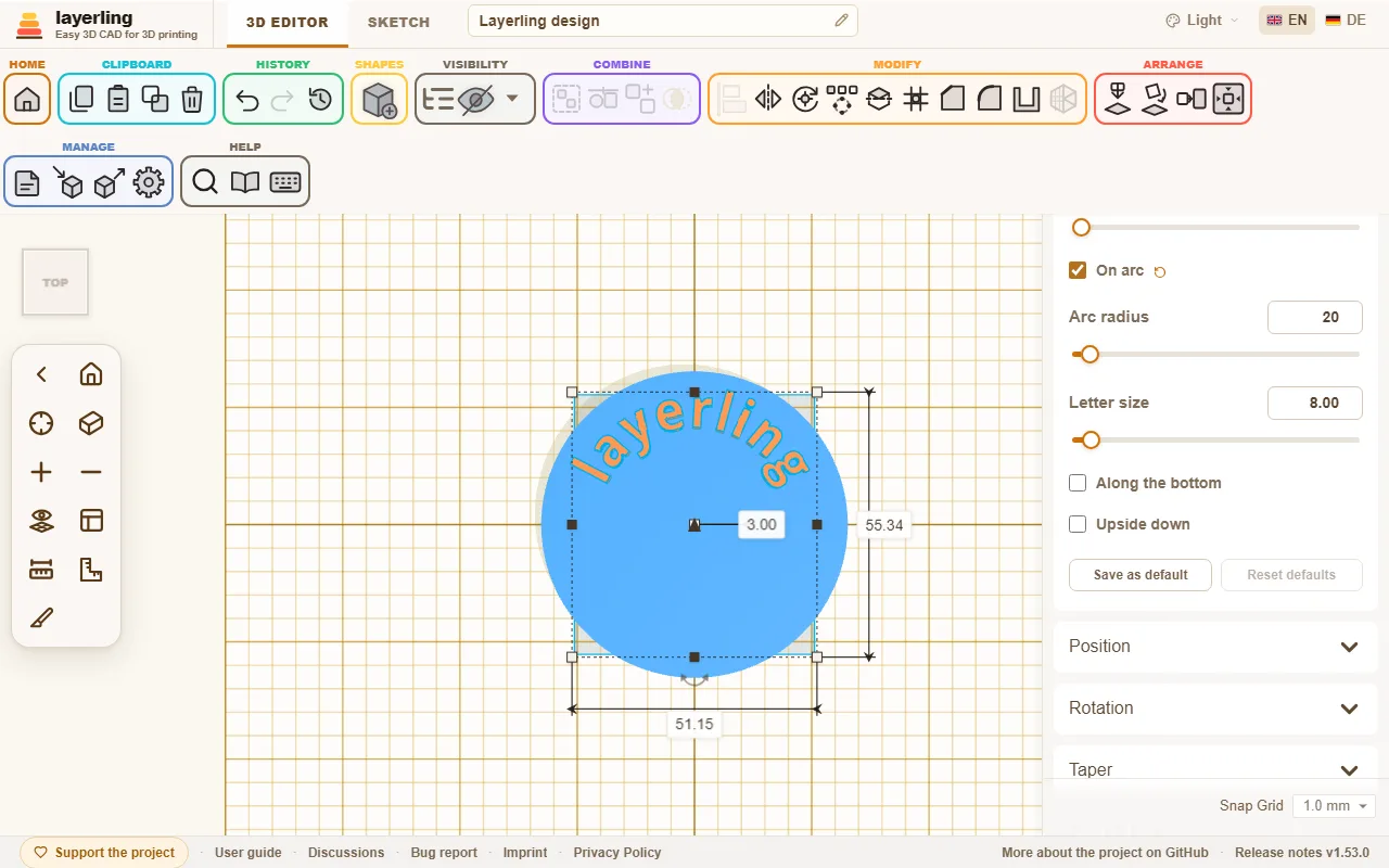
Once you switch it on, the text runs along the circle. All letters stand on the same baseline, as evenly as with normal text. There are four settings:
- “Arc radius” (5 to 500 mm): The radius of the circle the letters' baseline runs on.
- “Letter size”: How tall the letters are. It no longer depends on the width of the shape.
- “Along the bottom”: Moves the text from the top of the circle to its bottom. The letters then point with their heads to the centre.
- “Upside down”: Turns only the letters over so you can read them from the other side. The text stays in its place on the circle.
The centre of the circle is the centre of the shape. That is why aligning works as usual: if you centre the text with a cylinder or ring, it sits exactly concentric on it. When you pull a handle, radius and letter size grow together, so the lettering is not distorted.